Blog 9:Feedback and promotion
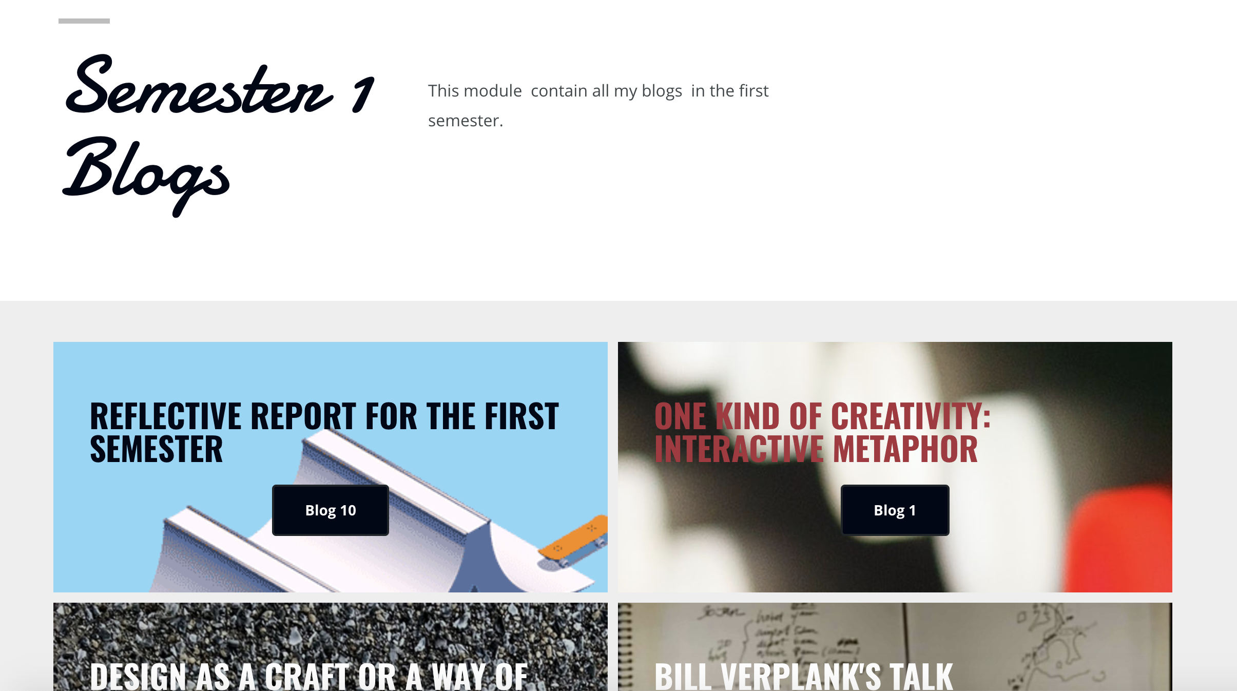
This week, I showed Jackie the layout status of my page and based on the feedback, I made some changes to the layout content of the site.
01
Home page
Before:
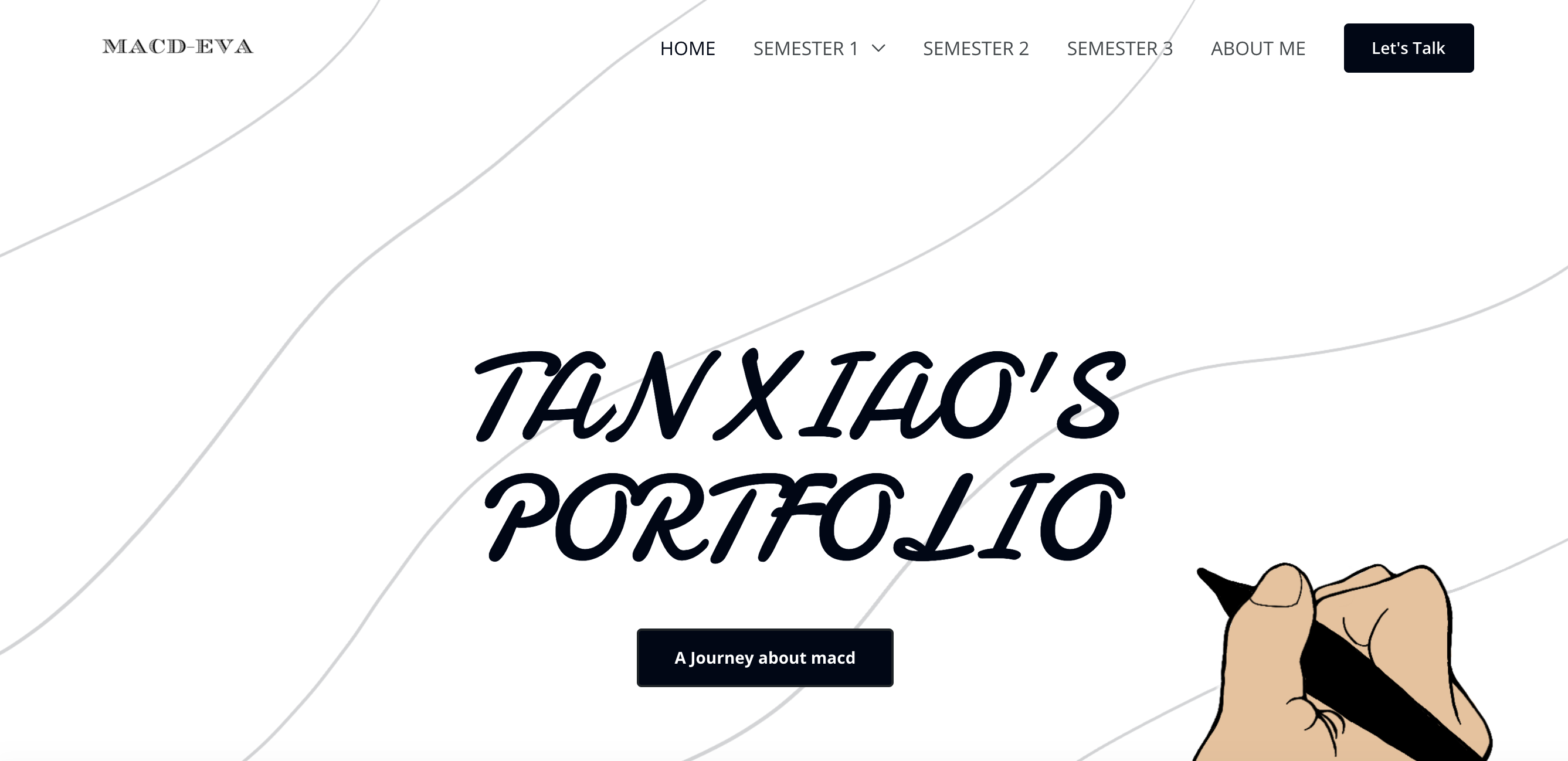
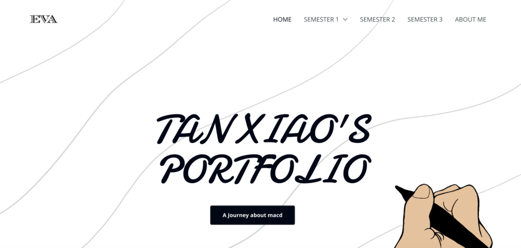
On the home page, the header is a bit messy, which confuses users. I modified the viewer of the website.
After:
The following are the screenshots of the site before and after the modification.
The changed web page is more concise and clear.
02
Blog content
Before:
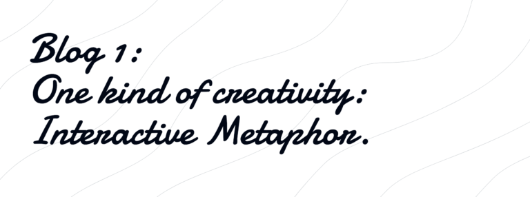
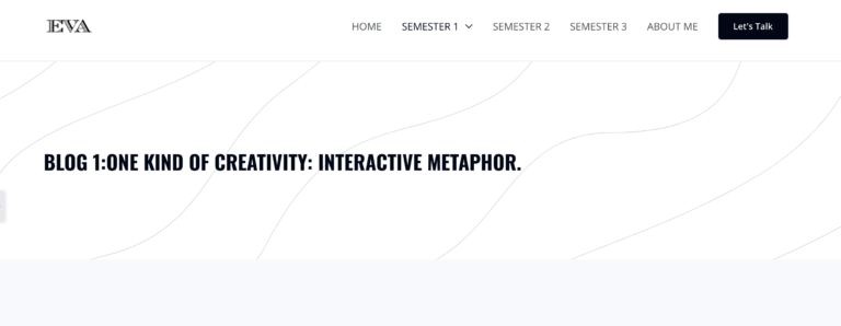
On the blog page, my headline font is not clear enough, I said the font was replaced with a clearer and more concise font. And I didn’t add brief to the blog.
After:
I corrected this. The following are the screenshots of the site before and after the modification.
There are many other problems with my blog. For example, I did not write the Reference List and brief in some blogs. In the process of correction this time, I have corrected this problem.Before
03
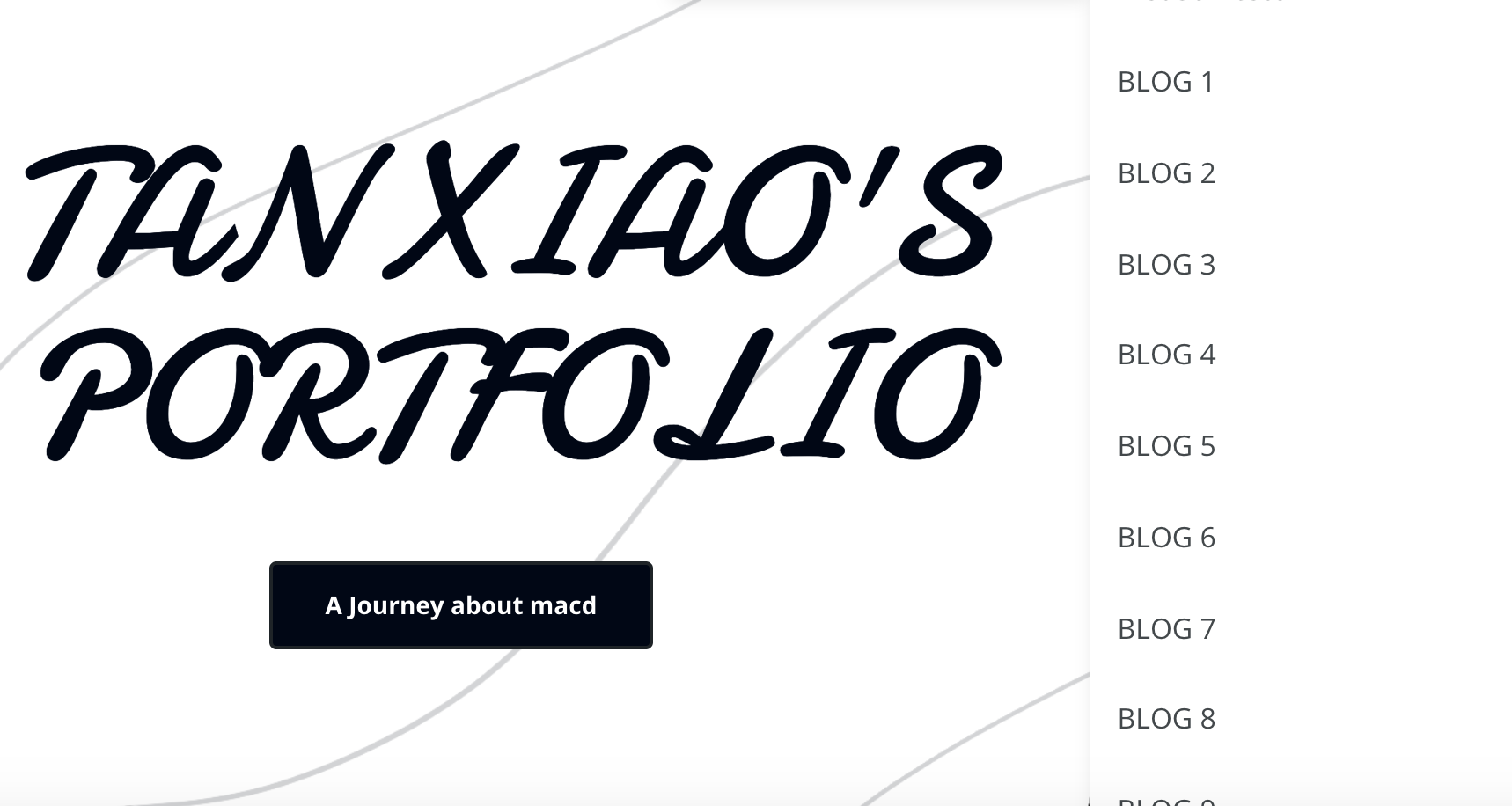
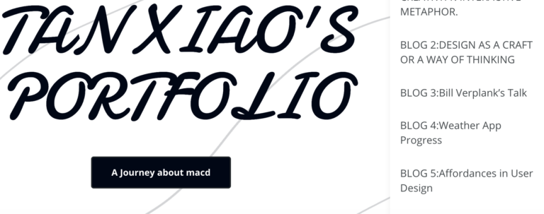
Catalogue
Before:
Without a title, viewers cannot understand my blog intuitively.
After:
The blog theme is very clear.
04
Blog page
Added more detailed blog catalogue and project catalogue, allowing viewers to browse the website more clearly.
